Dunkin': Breaking Up
With "Donuts".
QSR / Beverage
2019
$100M Stores
Simplification
Surgically Removed
Surgical Brand Strategy.
Airbnb is a movement. Old Spice is a reinvention. Dunkin' is something different: it is the definitive study in how to remove the one thing limiting your future without destroying what your customers already love.
This is about Discipline. It is much harder to change a brand partially than to change it entirely. Dunkin' didn't change what they sold; they changed what they were allowed to be.
They changed the Potential.
The Name as a Cage.
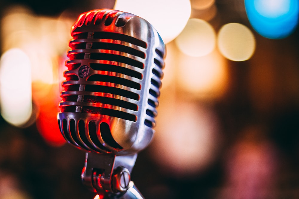
In 1950, the name was a description. By 2018, it was a limiting factor. Dunkin' was selling 60 cups of coffee per second, but the first word every customer saw was "Donuts." The brand was pointing to the bakery while the revenue was in the cup.
| Strategic Dimension | Dunkin' Donuts (Before) | Dunkin' (After) |
|---|---|---|
| Brand Name | A product-specific name that locked identity into a single food category. | The People's Name Simplified to what customers already called them. Unlocked the potential for total beverage dominance. |
| Category | Perceived as a bakery/donut shop that also happens to sell coffee. | Beverage-Led QSR A modern, on-the-go brand competing directly with Starbucks and McDonald's. |
| Competitors | Krispy Kreme and local bakeries. Confined to the breakfast pastry niche. | Market Expansion Credible competitor to high-end coffee rituals (Starbucks) and convenience rituals (McCafe). |
| Store Experience | Traditional QSR layout designed around pastry displays and basic service. | Next-Gen Design Tap systems for cold brew, dedicated mobile-order pickup, and mobile-only drive-thru lanes. |
| Credibility | Undermined by the name. "Donuts" implied a treat, not a coffee destination. | Beverage Authority Espresso, nitro, and cold brew platforms finally landed in a brand that didn't contradict them. |
Tony Weisman (CMO) understood that the name wasn't just old; it was friction. By simplifying, Dunkin' created the energy needed to compete for the millennial "on-the-go" morning routine.
Your Name is Your Positioning.
Most positioning is unintentional. It’s the sum of what you list first and how you describe your work. Dunkin' was unintentionally signaling "Bakery," forcing coffee-seekers to walk past their door. The name was doing active commercial damage.
Brand Promise
A heritage-focused Donut Destination trapped in a pastry-shop hierarchy.
Business Reality
A Beverage-Led powerhouse generating 60% of revenue from on-the-go caffeine rituals.
The Discipline of Deletion
Rebranding often fails because businesses swing the pendulum too far. Dunkin' knew exactly which assets held the equity and which were the anchors.
Protect // The Equity
- The Frankfurter Font: Identified as the single most iconic visual asset.
- The Palette: Pink and Orange—a combination unique to Dunkin' in the QSR space.
- The Apostrophe: A nod to the casual, friendly relationship with the customer.
- The Spirit: "America Runs on Dunkin'"—speed, democracy, and accessibility.
Amputate // The Ceiling
- "Donuts": Removed from every sign, package, and URL to unlock beverage authority.
- Nautical Language: Legacy heritage language that felt dusty and slow.
- Product Hierarchy: No longer putting pastries first in the consumer touchpoint.
- The Bakery Positioning: Moving away from Krispy Kreme toward Starbucks and McCafe.
Modernizing the Ritual.
A name change without evidence is just a sticker. Dunkin' coordinated a global system of changes to ensure the Beverage-First position was felt in the hand, on the screen, and in the drive-thru.
4.1 Test Before You Commit
Dunkin' reduced commercial risk by piloting the new concept in their most loyal market. This data-backed confidence allowed them to commit $100 Million to a national rollout with zero hesitation.
4.2 The First-Name Basis
Formalizing Affection.
- Colloquial Recognition: Customers had called them "Dunkin'" for decades. The rebrand simply made it official.
- No Alienation: By framing it as "customer appreciation," the brand didn't leave its past—it finally caught up.
4.3 Visual Precision
Preserving the Soul.
- The Font: The Frankfurter font was retained in full; it was the brand's most distinctive equity asset.
- The Palette: Pink and Orange remained identical, ensuring immediate recognition at 60mph on the highway.
Brand Promise
Made Physical.
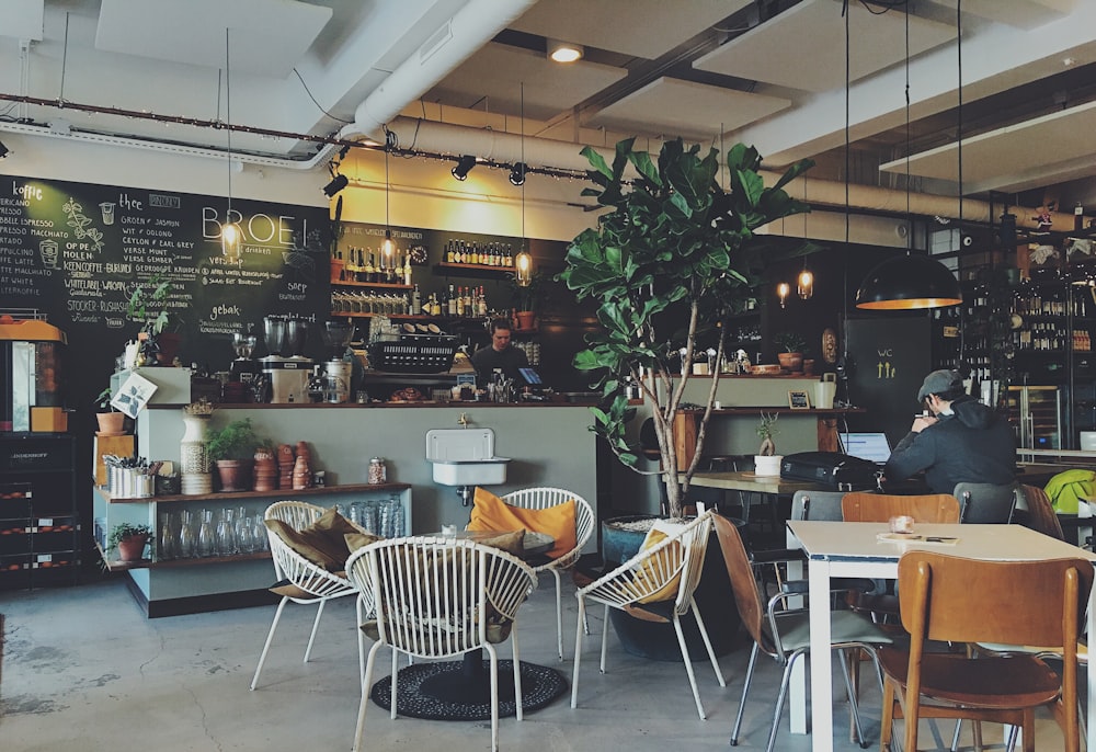
Eight-headed tap systems for cold brew. Dedicated mobile-order drive-thru lanes. High-speed pickup areas. Dunkin' built the infrastructure to prove its on-the-go promise.
Investment in Concept Stores
The Cultural Unlock.
Removing "Donuts" wasn't just about signage; it was about credibility. A brand called Dunkin' Donuts could never lead TikTok culture. A brand called Dunkin' could. This shift allowed the brand to act with the speed and humor of a digital native.
5.1 Premium Beverage Craft
The espresso platform was the first launch under the new brand. It was the Litmus Test for credibility. By Q2 2019, espresso sales grew double digits, proving Dunkin' could finally own the premium coffee routine.
5.2 Creator-Led Brand
The Charli.
The D'Amelio partnership drove record app downloads and a 45% surge in cold brew sales in a single day. Creator-as-Product became the new playbook.
5.3 Cultural Relevance
The DunKings.
The Ben Affleck Super Bowl spots leaned into the brand's "No-Pretension" identity. A bold, self-aware move that only a modern Dunkin' could pull off.
The On-the-Go Ritual.
Dunkin' didn't just change their name; they changed their permission to speak. A brand called Dunkin' Donuts had no story for the morning espresso crowd. Dunkin' owns the routine.
Audience Discovery
Credibility Building
Maximum Velocity
Experience
is the Evidence.
Bartender-style tap systems and glass bakery cases transformed the operational model. Donuts became an impulse add-on; Beverages became the centerpiece.
Positive Logo Reception
Cultural Capital
The Harvest of Simplicity.
A rebrand is a long-term commercial bet. While macro events like 2020 make isolation difficult, the evidence shows that Dunkin' created a brand that could survive disruption and capture the cultural high-ground in a way the old brand simply could not.
A Note on Intellectual Honesty
Isolating a rebrand's specific contribution from a global pandemic is not fully possible with public data. However, the trajectory established in 2019 proves that sharpening the beverage position was the right move at the right time.
Quantifiable Evidence
- The Espresso Proof: Comparable store sales growth hit a four-year high (2.4%) in the first quarter post-launch, led by handcrafted beverage sales.
- Digital Velocity: The Charli launch broke the all-time single-day record for app downloads, proving the rebrand had successfully captured the millennial/Gen Z market.
Strategic Capital
- Category Expansion: The rebrand allowed Dunkin' to compete credibly with Starbucks for the "Daily Coffee Ritual," a fundamentally larger and higher-margin market than donuts.
- The Unlock: Creator partnerships with Ice Spice and Sabrina Carpenter would have been culturally jarring as "Dunkin' Donuts." As Dunkin', they felt inevitable.
The Architecture of the Ceiling.
Dunkin' is the definitive case study for businesses that are already succeeding but feel their brand is a cage. Your work is good, your customers are loyal, but how you describe yourself has become a ceiling.
Hearts
From Nostalgia to Currency.
Before 2019, Dunkin' Donuts was a "pastry shop" people remembered. After the rebrand, it became a lifestyle brand that lived in TikTok culture. The name change gave the brand permission to be culturally relevant to a new generation.
Minds
Functional Credibility.
Every beverage product became more credible the moment "Donuts" was removed. You cannot sell a premium espresso ritual while your own name argues you are a donut shop. Context is the most powerful ingredient in your product.
What Dunkin' Did
- Diagnosed the Brand/Revenue gap.
- Protected the iconic Frankfurter font.
- Amputated the limiter ("Donuts").
- Made the promise tangible (Next-Gen Stores).
- Framed the change as "First-Name Basis."
- Tested the concept in pilot markets.
What Tita Studio Builds
- Audit of Positioning vs. Capability.
- Equity preservation of your best assets.
- Precise removal of brand limiters.
- Brand-to-Experience touchpoint audit.
- Rollout strategy that honors the past.
- A modern platform for new partnerships.
or a destination?
Dunkin' was already serving 60 cups of coffee per second while its name was still shouting "Donuts." The business had evolved. The brand had not. That gap was quietly costing them market position every single morning.
Is your brand reflecting where you are capable of going? Or is it still describing where you started?
The Discipline of Closing the Gap
Dunkin' invested $100 million not in a new product, but in Permission. The permission to grow. That gap is always costing you something. Tita Studio exists to help you close it.
That is what Tita Studio builds.
businesses@wearetita.com | www.wearetita.com
Surgical Evolution. Modern Audiences.